Visual Identity Design: Turning Strategy Into Something People Recognise
A logo is not a visual identity. It’s the most visible piece of one, but a strong identity also includes colour, typography, imagery style and a set of rules for using all of it consistently.
Visual identity design exists to make a strategy recognisable at a glance — on a website, a van, a business card and a receipt, without a redesign each time.
This guide covers how the process runs, what a complete identity system actually includes, and the mistakes that make identities expensive to maintain.
Why Visual Identity Design Starts With Strategy, Not a Mood Board
Skipping straight to visuals produces something that might look attractive and still miss the brand entirely. A calm, premium positioning paired with a loud, playful logo confuses customers before they’ve read a word.
The brief for visual identity design should already contain the personality, the audience and the one-sentence positioning. Design decisions get justified against that brief, not against personal taste.
What a Complete Visual Identity Actually Includes
The Logo
Usually a primary mark plus simplified variants for small sizes, single colour use and different aspect ratios. One version rarely covers every placement.
Colour System
A primary palette plus supporting colours, each with exact values (hex, RGB, CMYK, Pantone) so it reproduces identically across print and screen.
Typography
A primary typeface for headlines and a secondary one for body text, chosen for legibility as much as personality. Fonts also need a licence that covers every intended use.
Imagery and Pattern
A consistent photographic style, illustration approach, or graphic pattern that extends the identity beyond the logo into everyday materials.

Most growing brands are better served by a combination mark than by choosing one extreme.
The Logo Design Process
Step 1: Concept Development
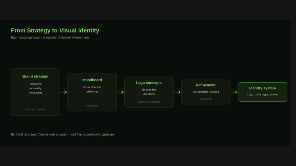
Explore three to five distinct directions, each rooted in a different angle of the brand strategy. Presenting only one polished option removes the client’s ability to choose a direction, not just refine one.
Step 2: Client Review and Direction
Choose one direction to develop, based on strategic fit rather than personal preference alone. This is the point to raise concerns, not after the identity system is built around it.
Step 3: Refinement
Test the chosen mark at business-card size and billboard size, in black and white, and reversed on a dark background. A mark that only works at one size or in colour will cause problems later.
Design tip: Test every logo in greyscale before finalising. If it stops working without colour, the mark is relying on colour to do the identity’s job.
Building an Identity That Scales
A visual identity has to survive contact with reality: a printer who can’t match your exact colour, a partner who needs the logo on a dark background, a junior designer building a slide deck without your guidance in the room.
- Document everything: exact values, minimum sizes, clear space rules.
- Provide the right file formats: vector files for print and scaling, optimised raster files for web and social.
- Build templates: business cards, letterhead and social templates prevent every new asset being designed from scratch.
- Plan for extension: icon sets, illustration style and photography guidelines stop the identity feeling incomplete outside the logo.
Common Visual Identity Mistakes
- Designing before strategy is settled: the identity ends up beautiful and unrelated to the brand’s actual position.
- Too many colours or fonts: a system with no discipline gets inconsistent fast, because everyone reaches for what they personally like.
- No small-size testing: intricate marks that look great on a screen often fail as a favicon or an app icon.
- No usage guidelines: without rules, every new hire recreates the identity slightly differently.
How Web Matrix Lab Approaches Visual Identity Design
Design here starts from the strategy brief, not a blank page. We present multiple genuine directions, then build the chosen one into a complete, documented system your team can actually use.
Our visual identity service covers logo design, colour and typography systems, templates and usage guidelines. As a result, your brand looks consistent everywhere it appears.
Related reading: brand strategy and rebranding strategy.
Ready to give your brand a face people remember? Book a free consultation with our design team.
Questions & Answers
How long does visual identity design take?
Three to six weeks after strategy is settled, depending on how many concept rounds and asset types are needed.
Do we need a completely new logo, or can we refresh the existing one?
Often a refresh — sharpening proportions, updating typography, simplifying a dated mark — achieves the goal without the cost or risk of starting from zero.
How many logo variations do we actually need?
At minimum: a primary mark, a simplified icon-only version, and single-colour light and dark variants. More complex brands need more.