Common Website Design Mistakes That Hurt Conversions
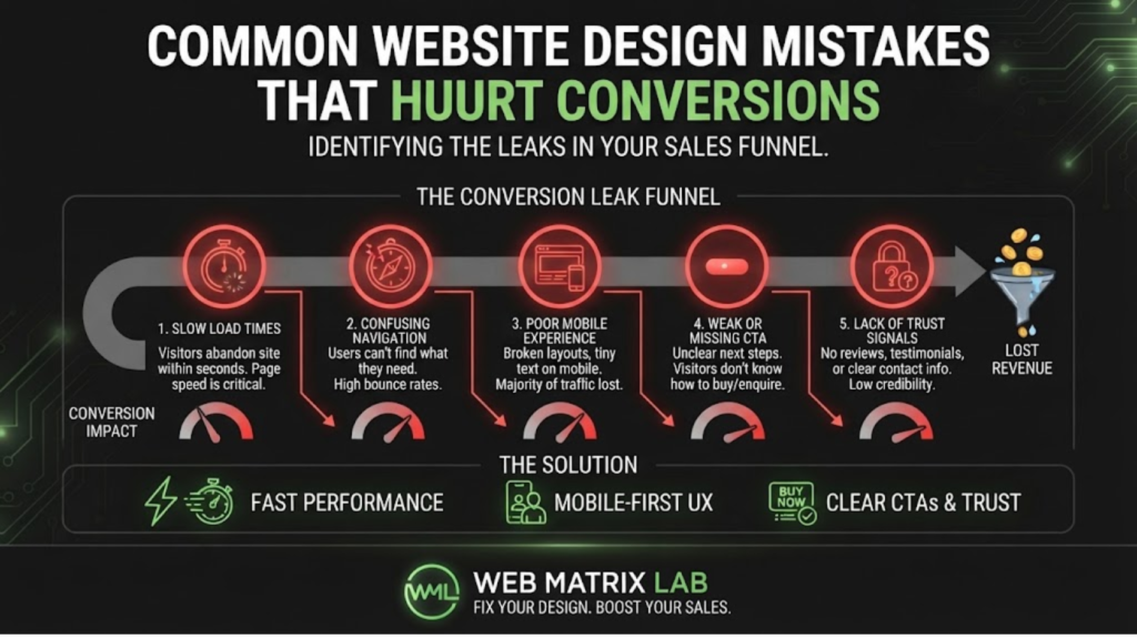
You’ve invested time and money into driving traffic to your website—through SEO, ads, or word of mouth. However, if visitors arrive and leave without converting, all that effort is essentially wasted. More often than not, the culprit isn’t your marketing at all. It’s your website’s design.
In this article, we’ll walk through the most common website design mistakes hurt conversions in practice, why they happen even to well-intentioned businesses, and exactly how to fix them so more of your visitors turn into paying customers.
Why Conversions Depend on More Than Just Traffic
It’s tempting to assume that more traffic automatically means more sales. However, traffic is only half the equation. If your website design creates friction, confusion, or doubt at any point in the visitor’s journey, even highly qualified traffic will fail to convert.
As a result, improving your conversion rate through better design is often far more cost-effective than simply pouring more money into driving additional traffic to a website that isn’t set up to convert it.
Mistake Severity Table: What’s Costing You the Most?
| Design Mistake | Typical Impact on Conversions | Difficulty to Fix |
|---|---|---|
| Weak or unclear calls-to-action | High – visitors don’t know what to do next | Low |
| Slow page load times | High – visitors leave before converting | Medium |
| Cluttered layout | Medium to High – overwhelms and confuses visitors | Medium |
| Poor mobile experience | High – loses the majority of traffic | Medium to High |
| Lack of trust signals | Medium – increases hesitation to buy | Low |
| Confusing navigation | Medium – visitors can’t find what they need | Medium |
| Too many form fields | Medium – discourages enquiry completion | Low |
Notice that several of the highest-impact issues are also among the easiest to fix—meaning small, targeted changes can often deliver disproportionately large improvements in conversion rate.
1. Weak or Unclear Calls-to-Action
A visitor who’s genuinely interested in your product or service still needs to be told exactly what to do next. Vague buttons like “Click Here,” buried contact forms, or calls-to-action that blend into the background all quietly suppress conversions.
However, this is also one of the easiest mistakes to fix. Clear, action-oriented buttons—such as “Get a Free Quote” or “Book Your Consultation”—placed prominently throughout the page can lead to a noticeable, immediate improvement in enquiries.
2. Slow Page Load Times
As covered in more detail in our article on page speed, slow-loading websites lose a significant portion of visitors before they even see your content, let alone convert. In addition, slow sites tend to rank lower in search results, compounding the problem by reducing traffic in the first place.
Since speed issues often stem from unoptimised images, bloated code, or poor hosting, a technical audit is usually the fastest way to identify exactly what’s slowing your site down.
3. Cluttered, Overwhelming Layouts
When a page tries to say everything at once—competing headlines, excessive text, multiple offers, and busy visuals—visitors often struggle to know where to focus. This cognitive overload frequently results in visitors leaving rather than making a decision.
On the other hand, simplified layouts with generous white space, a clear visual hierarchy, and a single primary focus per page consistently perform better, guiding visitors naturally toward the action you want them to take.
4. Poor Mobile Experience
With most web traffic now coming from mobile devices, a website that isn’t properly optimised for smaller screens is effectively turning away the majority of potential customers. Broken layouts, tiny text, and awkward scrolling all contribute to lost conversions.
Furthermore, mobile users tend to be even less patient than desktop users, meaning any friction is amplified further on smartphones. Prioritising mobile design isn’t optional anymore—it’s often where the majority of your conversion opportunities lie.
5. Lack of Trust Signals
Hesitant visitors look for reassurance before committing to a purchase or enquiry. Missing elements—such as genuine testimonials, clear contact information, recognisable payment icons, or professional photography—can quietly increase doubt at exactly the moment you need to build confidence.
Including simple, credible trust signals throughout key pages can meaningfully reduce hesitation and improve conversion rates, particularly for newer or lesser-known businesses. The Baymard Institute’s UX research offers extensive, evidence-based insights into what genuinely builds visitor trust online.
6. Confusing or Overcomplicated Navigation
If visitors can’t quickly find the information or page they’re looking for, they’re unlikely to persist—they’ll simply leave. Overly complex menus, unclear labelling, and inconsistent structure across pages all contribute to this problem.
In addition, confusing navigation often means visitors miss key pages entirely, such as pricing, services, or contact information, even when that content exists somewhere on the site.
7. Asking for Too Much Information Too Soon
Long, complicated forms are one of the most common conversion killers. Every additional field you ask a visitor to fill in creates another opportunity for them to abandon the process entirely.
However, this is a relatively easy fix. Reducing forms to only the essential fields—name, email, and a brief message, for example—can significantly increase completion rates, with additional details gathered later in the conversation if needed.
How to Diagnose Conversion Issues on Your Own Site
Rather than guessing which mistakes apply to your website, it’s worth taking a structured approach:
- Review your analytics to identify where visitors drop off
- Test your site on multiple devices, especially mobile
- Time your own page load speed using a free testing tool
- Walk through your own conversion process as if you were a new visitor
- Ask a colleague or customer to complete a task on your site while you observe
This kind of honest, structured review often reveals friction points that are easy to overlook when you’re too close to your own website.
Fixing These Mistakes Doesn’t Always Mean a Full Rebuild
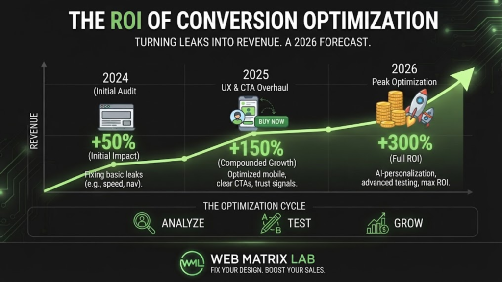
It’s worth emphasising that many of these issues can be addressed through targeted improvements, rather than requiring a complete website overhaul. Clarifying calls-to-action, shortening forms, and adding trust signals are all relatively quick wins that can be implemented without a full redesign.
However, if multiple issues are present simultaneously, a broader redesign often delivers a better long-term return than repeatedly patching individual problems. Our website design and UI/UX services can help identify exactly which approach makes the most sense for your specific situation.
Questions & Answers
Which website design mistake typically has the biggest impact on conversions?
Weak or unclear calls-to-action tend to have an outsized impact, since even highly interested visitors won’t convert if they’re unsure what step to take next.
How do I know which design mistakes are affecting my website?
Reviewing your analytics for drop-off points, testing your site across devices, and observing real users interacting with your site are all effective ways to identify specific issues.
Can fixing design mistakes really increase my conversion rate significantly?
Yes. Many businesses see meaningful improvements in conversion rate from relatively small, targeted changes, particularly around calls-to-action, page speed, and mobile experience.
Should I focus on driving more traffic or fixing conversion issues first?
In most cases, fixing conversion issues first makes more financial sense, since it improves the return on both your existing traffic and any future marketing investment.
How often should I review my website for conversion issues?
Reviewing conversion performance every few months, or after any significant design or content change, helps catch new issues early before they compound over time.